For TradingView scripts that are good for Wyckoff analysis, jump here. Paid TradingView plans will get 60% during Black Friday 2020. Get the free trial now and upgrade in Black Friday week! We have more Wyckoff in the “Wyckoff Trading” tag in the blog
Wyckoff Method Definition
Wyckoff Method is a strategic approach to trading.
The method is based on supply and demand.
Supply and demand is the basic dynamic at the root of market cycles. Richard Wyckoff, the method’s author, came up with patterns that simplify the analysis of market cycles.
The method was originally meant for stock markets. It is most useful on crypto markets these days.
Best Timeframe For Wyckoff
Wyckoff works in terms of supply and demand. This dynamic exists on any timeframe, but it has a bias.
It is best to start with higher timeframes.
Look for Wyckoff phases, establish the market bias, then look into details.
For initial analysis, the 1D timeframe is most recommended. It’s easy to get with TradingView FREE plan.
Wyckoff Phases
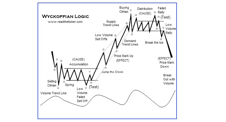
Wyckoff divides each market cycle into phases.
In each phase, the market has a characteristic direction:
- Markup phase: The market steadily advances
- Markdown phase: The market steadily declines
- Accumulation, Reaccumulation and Distribution phase: The market ranges (moves sideways)
This post focuses on Wyckoff method for ranging markets.
We will focus on Accumulation, Reaccumulation and Distribution phase here.
Wyckoff Method in Crypto
Wyckoff method entered the crypto trading community thanks to John Bollinger, the inventor of bbands.
He also suggested combining Wyckoff method with bbands.
Wyckoff Method with Bollinger Bands
All you need to do to combine Wyckoff Method and BBands is to treat the lines in BBands as baselines.
Instead of looking for new lows or new highs in terms of price, you look at their distance from BBands.
This approach is great for ranging markets, as Bollinger described himself on Meb Faber’s show:
“Bollinger Bands work fantastic on Bitcoin. And they work fantastic on all forex. There’s a reason for that. Currency trading is pairs trading - you’re long one and short the other, essentially. The idea is to earn a return at reduced volatility over time. So, forex is pairs trading and pairs have a statistical property, they’re stationary or they exhibit in the statistical parlance, stationarity. And it just turns out that Bollinger Bands work just a little bit better with series that exhibit stationarity. So, there is sort of a built-in edge to using Bollinger Bands on anything that’s a pair.”
This approach is great for ranging markets, because that’s where the pair behaviour is strongest in markets like BTCUSD.
- Ranging markets have lower volatility.
- With lower volatility the market is more likely to stay inside the BBands.
- It’s easy to measure how far any new lows or highs got from their side of the BBands.
We will go more into market ranges in the following section.
Read Later?
The psychology of reversals
Wyckoff ranges are often used to spot market reversals. The important ones, on higher timeframes. You have to understand the market psychology during a developing reversal to be able to use Wyckoff properly.
Script spotlight - bollinger bandwidth
Review of Bollinger Bandwidth Strategy from the TradingView script library.
Pattern trading in crypto (atnet glossary)
What are the highest probability patterns in crypto? How to do pattern trading right? How to not be a head-and-shoulders loser?
Market Ranges
A little recap.
Wyckoff divides each market cycle into phases.
In each phase, the market has a characteristic direction - or a lack of direction.
Ranges are market phases where volatility is low and price is confined within a certain level.
It might be tempting to say that the most important phase of the market cycle is the one in which the asset gains the most. But according to Wyckoff, ranges are in fact the key market phases. It is during sideways actions that the future bull run brews…Or the future bear slump.
Why are Ranges Key in Wyckoff
Wyckoff says market ranges are key.
What does it mean for you as a trader?
Market ranges are where experienced traders start scaling into a position in the anticipated direction.
This is the only way to avoid FOMO. Once the sideways phase is over and the market starts moving, you will be already riding on a profit. At this stage you can check the market once a day, maybe move your stop loss and move on with your life.
Recognize a Market range
- Ranges are market structures where the market is not trending.
- Ranging market is bouncing (roughly!) between the same two support and resistance levels
- Volume is typically declining with time.
This post focuses on ranging markets. That means will focus on Accumulation, Reaccumulation and Distribution phase here.
Wyckoff Phases: Accumulation, Reaccumulation and Distribution
Let’s explain each of the key Wyckoff ranges in simple terms:
- Accumulation phase: The long, slow bottom of the bear market.
- Reaccumulation phase: The breather pause midway through the run-up.
- Distribution phase: The topping pattern with multiple highs at the end of a bull run.
Pretty clear huh?
So, how do you tell whether the market is just taking a breather (reaccumulation) or whether it is actually the top (distribution)?
Wyckoff Reaccumulation vs Wyckoff Distribution
Hindsight is 20/20. From the high-level point of view, there is only one difference.
Either the market continues to rise, or it goes to Goblin town.
That’s not very helpful when analysing the market, is it?
The cue here is to look deeper into the market structures. You will see that the distribution and re-accumulation phases do differ.
Let’s look into the ways you can tell one from another.
Supply and Demand Patterns
The difference between Wyckoff distribution and Wyckoff reaccumulation boils down to the basics of supply and demand.
The basic principle of supply and demand is particularly important for crypto. The cryptocurrency markets not too regulated, there is less of institutional players, high-frequency trading is not as rampant.
Crypto is a good place to look at longer-term market characteristics.
The basic supply-demand dynamic goes like this:
- Excess supply leads to decrease in price.
- Excess demand leads to price increase
Wyckoff adds one additional point:
- The volume and the price change must be in harmony.
This is the so-called Wyckoff law of effort vs result.
A big price jump on thin volume is less valid than a price jump on high volume.
Additionally, small price change on high volume says that there is a lot of people on the other side of the market.
Stereotypical Market Behavior Patterns
This is first cue to telling reaccumulation from distribution range.
Long-term traders or hodlers will understand it easily.
There are typical behaviors that the market displays at the deal-breaking moments of market cycles.
In Wyckoff method, there are two critical patterns that you definitely should know. Both these patterns occur at the end of a market range, just when it becomes clearer to everybody which way the market is heading.
Wyckoff Range-End Patterns:
- “Trying to jump the creek”: The market rallies up towards a resistance level several times. It does not have to be the upper bound of the whole range, it can be an interim resistance! It gets rejected every time, there’s selling activity around the resistance line, but the sell-offs do not generate a lot of volume or follow-through.
- “Walking on thin ice”: The market is pressing down towards a support level. It does not have to be the lower bound of the whole range, it can be an interim support! On this support level, it gets bought up, but the volume in these rallies is thin. The buying activity will not last long, the market will move south.
These end patterns can be positioned mid way through the range, which can be confusing. The key metric to follow here is volume vs price change.
- Small price change on high volume says that there is a lot of people on the other side of the market.
- Large price change on large volume says the market is likely to move in the current direction.
Learn to read these range-end situations. You will be in the best position to ride a trend from the moment when its direction is in all likelihood decided but a lot of other traders did not get the memo yet.
Market Reversal Patterns on BBands
Bolling Bands reversal patterns likewise rely on stereotypical market psychology.
- Typical Top: “Three pushes to a high”, which shows market greed. More on three-pushes patterns in ATNET Glossary.
- Typical Bottom: “W-Bottom”, which shows market fear.
These two reversal patterns are, in fact, market ranges.
They are simpler and shorter than Wyckoff ranges, but they are still ranges. Markets don’t turn around and reverse within one 5 minute candle, unless they are a shitcoin market traded by maybe 4 people.
On markets with decent liquidity, like BTCUSD, such an instant agreement doesn’t happen.
Now that we know reversal patterns are ranges, we know how to use Bollinger bands with then: BBands provide the balance boundaries for a market range.
The center line on Bollinger Bands (a moving average) is the mean price around which the ranging occurs. To you that will be the baseline.
Your edge is in that this line is not perfectly horizontal.
A simple horizontal price level is most other traders’ baseline.
The upper and lower Bollinger Bands are standard deviations of the baseline. Quite intuitively, they tell you how far the market overshoots in each direction.
To you, the standard deviations will be the limit of the market range, even though they are not perfectly horizontal.
Telling a continuation pattern (Wyckoff’s reaccumulation) from a top pattern (Wyckoff’s distribution) becomes quite easy.
- If you expect the market to move on in a bullish bias, you absolutely need to see it to progressively overshoot downwards less and less
In a Wyckoff w/ BBands setup, this translates as higher lows relatively to the lower BBand.
Due to market psychology, this will typically look like a “W”. There will only be two lows, on the second one people will start noticing the good buy opportunity.
- If you expect the market to move on in a bearish bias, you absolutely need to see it to progressively overshoot upwards less and less
In a Wyckoff w/ BBands setup, this translates as lower highs relatively to the upper BBand.
Due to market psychology, there will typically be three highs. Quite some traders will be buying up here, expecting the market to continue up, “as always”. The long bias is the reason why the topping pattern has 3 peaks and the bottoming one 2 throughs.
You can absolutely look for lower highs and lower lows relative to the price as well, of course. It’s not wrong, it’s just a bit too basic.
With BBands, the same information gets clear sooner.
TradingView Tools for Wyckoff Trading
- Make your FREE TradingView account here!
Volume Indicators
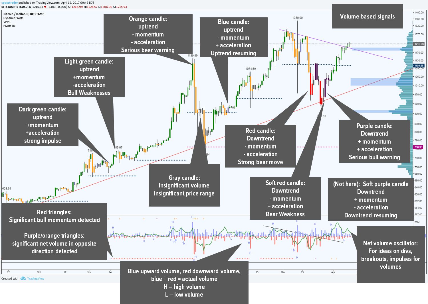
Volume vs price change is key information in Wyckoff analysis.
Either the price change and volume are in sync, or there is a divergence between them:
- Price drops. Volume is rising while price gradually drops less and less with every new candle – that’s a price vs volume divergence.
This situation tells us that there is significant demand. Thanks to this demand, the drop will not be able to continue for much longer.
- Price drops. Volume is rising while price keeps sliding down – no divergence here.
There is not enough demand and plenty of supply. The price is bound to drop some more.
- Price rallies. Volume is rising but price starts topping – again, that’s a divergence.
Local top there, there is not enough demand to push through.
- Price rallies. Volume is rising and price is still pumping – no divergence here.
The market will keep going.
Measuring Volume On TradingView
There are classic volume-based indicators like on-balance volume.
I find the easiest kind of volume indicator to work with are colored candles.
There are a bunch of scripts on TradingView, this one is pretty good:
Volume Flow Script by spacetrader
- Make a TradingView account.
- Get the script or search for
[ST] Volume Flow v6in the script library. - Read the color key.
Measuring Price Change On TradingView
ROC (rate of change) is a default technical indicator available from the TradingView as well as on crypto trading platforms that use TradingView charts.
Bitfinex charts have the ROC option.
Bollinger Bands on TradingView
Since BBands are one of the most popular charting tools not only for crypto markets, there is a lot of scripts and strategies on TradingView that feature them.
- Bollinger Bandwidth to alert you on range ends, which are the periods of lowest volatility
- The %B indicator telling you the distance of the current price of its band
- For scalpers, there are even ready-made TradingView strategies with BBands. They are very simple, but something to work with.
1W/1D Wyckoff Range Study: BTCUSD in 2017
As they say, hindsight is 20/20.
Still, let’s take a look at the market ranges that we got during the year of bitcoin’s 20k ATH.
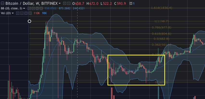
Exhibit A: Weekly BTCUSD chart with the infamous 2-year bear market:
Do you see the accumulation structure at the bottom? This is where the bull run was born.
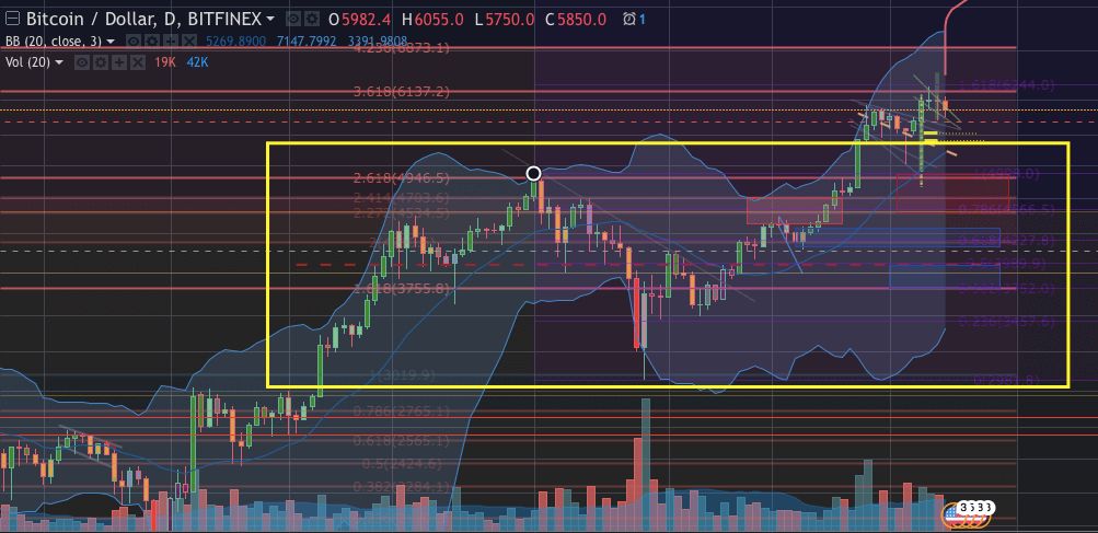
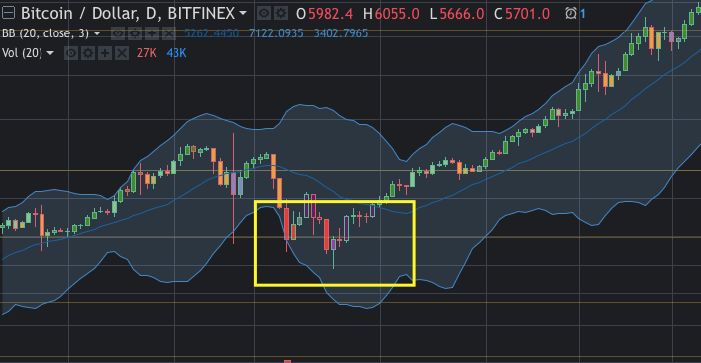
Exhibit B: Daily BTCUSD chart of a BTCUSD continuation action.
The structure A/ formed after a long downtrend. Back then, crypto as a whole was shaken by MtGox bankruptcy.
The common opinion was that bitcoin was going to bleed out into death and that the cryptocurrency experiment failed.
From a different point of view, savvy investors were in the position to literally buy bitcoin wholesale.
Buying the capitulation, provided the trader sees a fundamental opportunity in the asset.
In this case the individual narrative could have been that there simply are situations that require a payment method resistant to censorship and regulations. A collapse of an exchange could not have any impact on that.
W-Bottom Study: Simple W-Bottom vs BBand W-Bottom
Let’s take the W-bottom formation. On the chart’s vertical axis only, you’d think of it like this:
- If the price of a bottom 2 is higher than the price of bottom 1, it’s a higher low and a convincing bounce.
- If the prices are the same, it’s still a W-bottom but somewhat weaker.
- If the bottom 2 is lower, it might not be the final bottom yet.
With bbands you will look for the 3-push and W-bottom structures relative to the bbands:
- If the bottom 2 has lower price than bottom 1 but is farther up from the lower bband than bottom 1, it’s a strongly convincing bottom. The edge lies in the fact that it’s a higher low relatively to the bbands, a bullish structure that a lot of traders will miss.
Deeper Analysis: Ranges within ranges
This will be useful for short-term traders.
Let’s zoom into shorter timeframes and look for ranges within the range.
- In every range, there will be part of a price action that will trade closer to the upper boundary of the range. That can be identified as the micro-distribution.
- From there, the price might drop to the middle of the range or deeper and consolidate there for a bit.
- In crypto, it typically results in a deeper drop: the micro-accumulation.
- From there, the price gets bought up towards the middle of the range again. The future direction depends among other things on the strength of the bounce.
You can use micro-ranges either to scalp the range (this is called formation scalping), or to get more information about the market bias that is currently forming.
Finding the inner market ranges
Start at a high timeframe and find the macro-range.
Here is a 1D BTCUSD with a range:
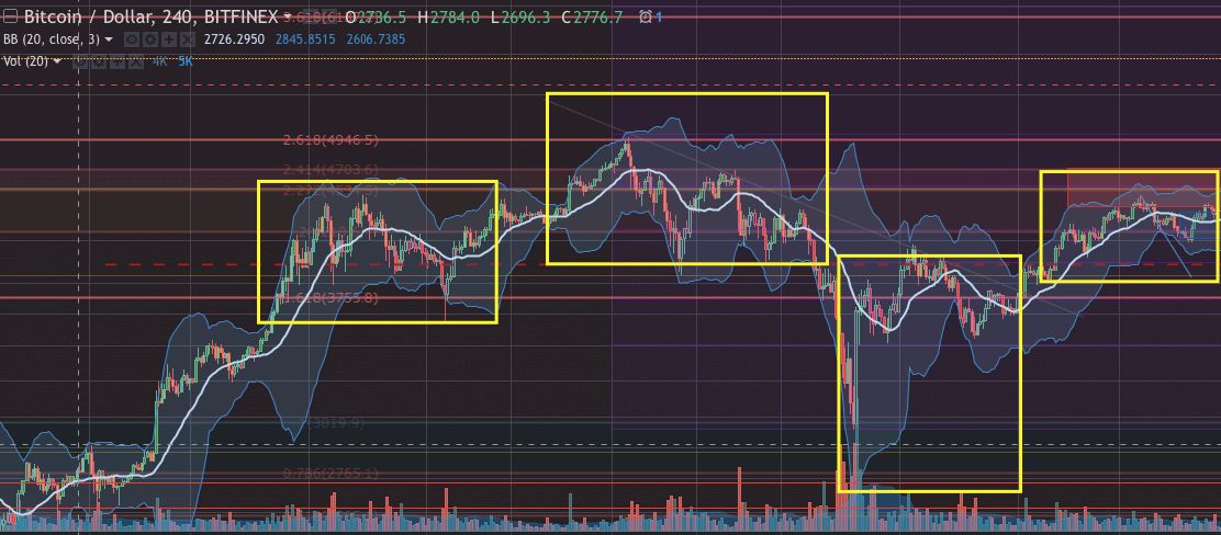
Now let’s switch to 4H:
Here you can easily spot the first micro reaccumulation range:
- Market reaches a resistance, tests it several times. In this case there were some long-term Fibonacci retracement lines.
- Relevant bband basis starts curling down.
- Price-wise, higher highs form but are already further from the upper bband, indicating weakness.
- Eventually, the market drops below the bband basis and fails to return up over it.
- Panic drop occurs but is bought up with force.
- Market continues upwards.
The second inner range was a distribution:
- Market hits an important fib line and makes a sharp top.
- Negative volume keeps picking up.
- Drop to median of the outer range (red dashed line) gets bought up but this rally crashes and fails to push through resistance.
- In a very simplified way you can say that if the price keeps pressing onto a support/resistance for some time, you can assume it will break it, even if only for short time. With support/resistance, it’s typically either a clear bounce, or it goes through.
- Market continues downwards.
On the whole:
- Looking back at the 1D chart, the market made a W-bottom
- This higher low happened both price-wise and relatively to the bband
- Then the market managed to push through a resistance line
The verdict is a reaccumulation: A continuation structure in a bull trend.
Looking at micro-ranges will give you more information about the state of the market.
This will translate into the longer-term market bias, but at the same time it will let you make some extra profit short-term trading.


